Saturday, September 25, 2010
Friday, September 24, 2010
Prototyping
Elements:
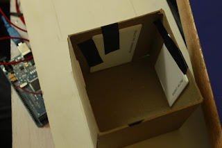
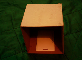
Blocks, A low table with depressions for each block , 16 RFID Tags, 4 RFID Readers, Arduino Mega, Computer and Projector.
Materials:
Blocks:
Mount Board- 9.8cm by 9.8cm
RFID Tags stuck to 4 faces of the block from the inside
Table:
Plywood and Veneer Sheet OR Acrylic Sheet (3mm)- Approximately 62cm by 18cm
Saturday, September 18, 2010
An Update
I will be using Radio Frequency Identification (RFIDs), instead of the Augmented Reality technology. RFIDs don't require the markers on the block itself, they can be embedded within the cube. They also have quite a large range, so while putting the blocks together, they don't necessarily have to be touching each other, unlike Augmented Reality. This makes the interface more flexible, and easier to play with.
Each block will have 4 working faces, with an RFID Tag embedded inside each face. The table surface will have an RFID Reader embedded under it, so it reads the Tag(s) of the faces which are placed on the table (The side of the cude that faces down).
Flowchart:
Mapping the flow for all the permutations and combinations between 2 blocks to begin with.Once this is coded, the program can be modified to work for all the blocks.
Visual Style:
I am currently working on the visual treatment, data visualization, and fixing upon the all the characters. After this is done, I will start animating. The following image is work in progress.
Thursday, September 9, 2010
Concept: 4th Draft
The third version of the needed some tweaking, to make the system tighter.The main changes are:
There will be no 'Comparison' block, since that is mainly a tool, and does not add to the narrative building. When two characters are placed together, the comparison of their sizes is automatically generated on screen.
The 'Properties' are separated from the 'Modifiers'. This makes the structure more flexible, and increases the possibilities of interactions.
(As of now I am working with four faces per block, keeping in mind the time frame. This system is open to expansion though.)
The 5 Blocks:
Permutations:
(The above images are just to give an idea of how the interactions between blocks relate to the animations on screen. This is not the illustration style I will be using for my animations- Still working on that.)
Style:
I am working on Characters, and the visual style of the animations. The images above give an idea of the look and feel of the animations, colour scheme, tone etc.
Key elements:
'Weird' Characters
Colourful
Mixed Media
Incorporating Data Visualization, without making it look clinical.
Monday, September 6, 2010
Notes
Feedback from Victor:
Feedback from teachers at M.A.I.S:
To-do this week:
- Separate the Modifiers from the Properties (D, S and T)
-Properties: Speed, Distance, Time, Size, Quantity
-Modifiers: Double, Triple, Halve, Square, Quarter
- Represent the mathematics visually
-No numbers
-Graphical representation
-Animation
-True or false- Use the compare block to test, instead of calculate
Feedback from teachers at M.A.I.S:
- Add an element of ‘process’ to the mathematical data
- Can the child map out his/her flow? How he/she arrived at any particular problem, solution or story?
- Since this is a mathematical tool, it will be more effective with the use of numbers, instead of a graphical representation (Unless the math concepts are more ‘spatial’ than ‘numerical’)
To-do this week:
- Finalize the system
- Character explorations
- Visual Style
- Create a web simulation
Wednesday, September 1, 2010
Subscribe to:
Comments (Atom)


